Sunday, August 9, 2009

idyllwild adventure

Here is a great summary of class #2 of my Idyllwild adventure for your browsing pleasure (by the instructor, Lesley Riley)... until I get myself organized enough to write about it...
This is one of my favorites of what I did... substrate is costco US panty fabric
overlaying textures include: stencil made from "background" from dot stickers and brushwork over bubble wrap laid underneath

Thursday, July 9, 2009

booklet from reject print

here it is piled on top of test prints for next project

I printed black scribbles on inside and hand wrote some extra "legible" text
I'm going to get a polymer plate made of "inside" and put it through letterpress for class
the impression from letterpress will be a nice extra
think I'll put it through the press twice so I can keep this size for book (I'm making a 8.5 x 11 plate) Experimented with folding a letter size sheet and book too too small.

Wednesday, July 1, 2009

great review in ArtScene


I created a special section on my site about our show for Suvan which worked out really well!
there's Screen on the ArtScene virtual wall
the review

Thursday, June 25, 2009

I didn't "see" it until yesterday


While working on my show brochure, I noticed that the Veils pieces, if you squint your eyes and see them really, really small, are landscapes! The SAME kind of compositions that I use in my realistic work. I guess it's innate. And I never, never noticed this until yesterday.

Sunday, June 14, 2009

the last piece to get done

I totally forgot that I was thinking of doing some pieces with acrylic transfer of laser prints. And I'm not sure what caused me to remember it yesterday or the day before... Anyhow, one perk is: don't have to rely on a service bureau for printout so can delay completion until the last minute. Another is: I can build it up in a way similar to the old collage piece "Screen". Since this last piece is a "friend" to that one, how appropriate. Yet one more perk: process will be "hands on" vs digital.

I've never done this method, so I googled "acrylic medium image transfer". These 2 links are my favorites:
http://www.calsk8.com/zeitgeist/acrylicgeltransfers.htm
http://www.ebsqart.com/artMagazine/za_513.htm

Of course, I only have inkjet here, so I'm going to do some printouts @ work tomorrow. I rescanned all the "Veils" monoprints that had colors I liked yesterday on the 11 x 17 scanner in my classroom @ Otis. Data all on the iPod and ready to print (hopefully with no or minor color adjustments).

Wednesday, June 10, 2009

countdown to deadline -- anything to frame must be finished and delivered today

Two prints to finish... or maybe just one... or is it two...


This newest one cries out to be a banner shape -- I'm going to keep the 19" width and have this sort of thing repeat for 72" Then it'll be friends with "Screen" (which was my intention for this one)


I won't be framing this so I only have to worry about getting it to a service bureau in time for the printing

Below is one of the old prints that I scanned to create the above digital. Trimmings and reject prints from its series were used to create Screen

"Veils #16" silkscreen monoprint, 18 x 10.5"

Saturday, June 6, 2009

another new one

This one printed out much darker and duller than how it looks on the monitor (THAT problem) so I need to tweak the image
or maybe I'll go into the print with handwork
haven't decided

It's a combo of scanned dip pen marks (both used on previous 2 prints)
I like the way it looks like handwriting but doesn't say anything

(And, perhaps this is sad, I see these marks could work well on a panty print... gotta come up with new designs for Costco US and, well... here they are... hmmm, maybe I could count an hour or so as "offsite" time and get paid haha).

done (I think)

Inked #2 13 x 19" Digital Monoprint

Tuesday, June 2, 2009

restart

this one is a good start gone bad...

I was happily feeding this through the printer, one layer at a time, letting chance create the layered composition and then I decided it needed some new different marks...
I drew some with litho crayon, scanned, made a repeat and put it through the printer again
well
I forgot to specify the printer when adjusting the paper size and it printed the wrong way (plus I don't like the scale of the marks -- too big) doh!

I liked this print a lot until the last pass, and decided to replicate the process
THIS TIME I used layers in photoshop to fine tune the blending:
still not quite finished, but getting close

Sunday, May 31, 2009

something new

"Inked" digital monoprint, 13 x 19"

something new (phase 1)

here is the first printing of the new digital piece

it seems to "beg" for some red marks that also have the "inky" look
after attempting some digital solutions that for various technical issues wouldn't fly (wrong OS for tablet on this machine, can't find Painter software CD to install on laptop with correct OS, etc etc), I went ANALOG.
found my tin of Grandfather's dip pens, found the jar of ink, made some marks and now I've gotta wait for the ink to dry so I can scan... to be continued...

something old

"Slashed #4" Lithograph, 15.5 x 21"

I scanned more old prints @ Otis yesterday (they have 11 x 17 scanners and I had to be there to teach). I encountered the old problem of too much data, not enough storage... forgot to take my iPod that has 8G of empty space - doh! So had to save some of the scans on the CPU there... hopefully, they'll be there next week...
(too lazy to drive over there and rescue them any sooner).

The scanning process -- sitting, waiting for the preview and the digitizing -- helped me focus on which old pieces I want to revisit and reuse. Because of the press release I wrote, I'm looking more at the ones that are about weaving. I think the above qualifies and I'm attracted to the marks and ink blotty bits. So this is today's image that I'll fool around with. Results will post in a while...

Wednesday, May 27, 2009

writing a press release blurb on work that doesn't yet exist -- be vague

In Pattern Recognition, Anne M Bray plays with motifs and materials she developed more than thirty years ago. "For the past five years, I’ve been designing prints for an intimate apparel company and this has lead me to reconsider my old pattern-based work." Multiple layerings, fragmentation and interweaving are all themes in both old prints and collages and new digitally derived mashups. "I was surprised to discover how quickly I slipped back into my old methods of working, despite using new technology."

Monday, May 25, 2009

I found what I was looking for

finally!


The above is one more large piece that I discovered a few days ago. that's Chuey "helping" me document it.

Below on the left is a small sampling of what I found today.
Now I need some place where I can lay it all out and really see what I have... without the cats walking all over it.

From my brief rifle through the portfolio, many items which I don't remember -- very exciting:
the 2 items above on the right are new part-way done digitals
scanned some new marks, now layer, layer, layer


june 2009

june 2009, originally uploaded by anne m bray.
here's june --
go ahead, drag it to your desktop

Thursday, May 21, 2009

what's going on

I recently decided to join in on a show @ TAG that opens 6/24. That in itself is crazy. And then I got really bad bursitis in my drawing shoulder. Such pain I couldn't lift ANYTHING!

Anyhow, I was revisiting my old work from the 70s -- abstract patterny prints + collages:

(Above is a 19 x 18" detail of a 72 x 56" collage on canvas that is being used on the invite card)

I've found only about 5 of the old smaller pieces (which I'm hoping to find the rest to help, um, fill the wall space) that I'd pulled a couple of years ago... Where are the rest?? Somewhere in my art storage area, blocked by boxes of framed art that I can't move. ARGH!

So rather than dwell on the above issue, I scanned what I have and started experimenting digitally. I took this old lithograph:

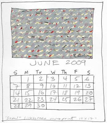
and then started doing multi printing passes through the printer. This is similar to the technique that I used to use with the silkscreen as shown below:

(I'm worried that these marks look too much like the Nike swoosh - that branding wasn't pervasive when I created this in 76, but now...)

My limitation with the inkjet is that I don't have the opacity of color that I had before. So I need to plan it out a bit.
Here's 2 bits of what I did yesterday:

Well, it's a start...
Very much fun, I will say that. They need way, way, WAY more layering

Wednesday, April 15, 2009

a most mysterious technique

This comes from a studio in Korea
All they will reveal is that it was done in photoshop

I first put this up on Facebook, but realize that the discussion needs to widen. I've compiled the initial comments and ideas in the first comment below.

To me, the shading looks like a half-tone dot screen effect...


When you zoom way in, you'll see within the dots are dot gradations -- herein lies the mystery!