Saturday, August 20, 2016

#August2016crayons Spoonflower Weekly Challenge

Design brief: "Life is like a box of crayons, so color your world! Create a design with color and fun!"
crayons
find this on Spoonflower 
I did some sketches of crayons (using the color of the crayon to sketch it) a while ago.
Thought they'd be the perfect thing to use for this week's Spoonflower Weekly Challenge.

Here's one of the sketches:

Crayolas have the craziest names now!

Friday, August 5, 2016

#Aug2016ABC123 Spoonflower Weekly Challenge

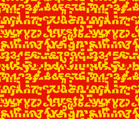
ABCs, 123s 
Design brief: "Letters and numbers, the building blocks of our world. Let your creativity fly as you design with letters of the alphabet and/or digits to your hearts content." 
ABC123_red-gold
find this on Spoonflower 
Shall we venture backwards in time to see other design options that I came up with? 
My building blocks:
I typed A-Z and 0-9 into an Illustrator document. I then printed it out several times, and cut some of the prints into strips using a paper cutter. I took photos of my various layouts as I made them. I know I could get a cleaner final file by splitting the elements in Illustrator, but it was fun fooling around with scraps of paper and I was able to try out different things quickly.

I got the letterform splitting idea from stumbling across the work of Cecil Touchon last week 
(from WGSN? Artsy? Can't remember!)

Friday, July 29, 2016

Textile Design Lab's Summer of Creativity: Editing a Texture

Look!
This:
Came from this:
Lesson Two was a quickie editing technique for textures that ended up working out well on my 2nd try.

1) Added "Content Aware" fills by making a selection, Select > Inverse, hit Delete (choosing Content Aware)
1A) a misfire -- cropping area has too much white edge
[from here on, a reenactment] 
1B, Red shows a tighter selection, better all-over fill 
2) Cropped to an area that I liked (this art not in repeat)
Next, I'll show crops of the transformations without the step-by-step directions.
Maintaining a bit of mystery, since it's not a free course.
 Oops, reenactment doesn't match. Oh well -- glad that I saved the original!

The Textile Design Lab is a monthly membership fee-based site. Well worth it, so far!

Linking up with Shelbee's On the Edge of the Week


Saturday, July 23, 2016

Textile Design Lab's Summer of Creativity: Stamping

Tactic #2 to generate some new personal designs was to join in on the Textile Design Lab's [TDL] Summer of Creativity [SoC]. There are weekly lessons, projects, and videos for seven weeks.

Week One is Stamping.
I totally forgot about stamping! 
Remember this piece? Probably not, it's from 2010:
[from the "What If" series of posts]
I stamped with bubble wrap and a bottle cap, and painted on a stencil on a dot print strike-off from work.
Enough history! Get to the stamping! 

On Wednesdays, there is a TDL One Hour Challenge which this week related to the stamping lesson.
Just my cup of tea -- a little creative play date, without a heavy time commitment.
Bonus: this week it's all analog. Deploy the ink and gouache!

I opted for finding six random items to use for stamping, and spending ten minutes stamping with each.
My tools:
Dessicated Lime, Golfball, Cork, Fake Fur, Shoe, Zip Cartridge
I cleared a space on my studio table:
And used the golfball with ink (you can see it resting in the ink puddle above).
In ten minutes, I filled sixteen pages with textures! Very exhilarating!
In my second session with the golfball,  I used ultramarine gouache (which very quickly merged with the leftover ink due to gravity and general sloppiness):
My goal with the gouache was to see what kind of marks I'd get with a more "watercolory" medium.
Eighteen pages generated!
My third session with the goofball golfball was stamping with acrylic paint.
[Trying to find my acrylic paint was no walk in the park. But that's a topic for another post].
The goal was to see if the marks were different with an opaque medium.

Totally forgot how stinky acrylic paint is. Especially 30 year old puff paint. Not very opaque either.
Results, 13 pages:
Mr Lou, my studio assistant, remained unimpressed.
Thirty minutes total with one "tool", forty seven pages of textures = SO much fun!

But I don't think I'm finished yet -- now I want to try the golfball with oil paint, because THAT is truly opaque.
Will add my results if I get to it.

Friday, July 22, 2016

Spoonflower's Betabrand Challenge and Contest

See the plaid in the upper right? That's my entry for the Spoonflower's Betabrand contest.
Some of the prints that I voted for. Yes, I voted for myself! 
The design brief:
"Our Betabrand Double Take Design Challenge seeks designs that invite a second glance to add to their lineup of prints. We are looking for quirky new takes on classic patterns, designs that reveal more than meets the eye upon a second glance, an allover print that could be two things at once..."

A closer look:
Link to design
Winners are determined by popular vote and with 568 randomly displayed entries, it's a lot to slog through. I haven't figured out if there's any way to direct you to my entry. Sigh.

My source images, which I found in the kitchen:
Steamed rice in a saucepan
Chopstick
I edited the imagery in Photoshop, then built the repeat in Illustrator. 

Joining this challenge was part of an effort to do more personal design work. It's difficult to get inspired to do my own projects after spending four full work days creating repeats for the money job. Baby steps!

Adding this to Shelbee's On the Edge of the Week linkup. Maybe I'll generate more votes?

[7-28] The winners are here.


Saturday, May 7, 2016

Throw In the (Beach) Towel

New thing available at Society6 -- towels!

In addition, they're offering free shipping through midnight, May 8.
Use this extra special link.

**I will get 10% commission on every towel sold.
Thanks!

Tartans A-Z Master List

A-Z Tartans

Tartans of the US and Canada
Table of Contents links

Introabout the A-Z Challenge
A is for... Alabama, Alaska, Alberta, Arkansas
B is for... British Columbia
C is for... California, Colorado, Connecticut
D is for... Delaware
E is for... Prince Edward Island
F is for... Florida
G is for... Georgia
H is for... Hawaii
I is for... Idaho, Illinois, Indiana, Iowa
J is for... New Jersey
K is for... Kansas, Kentucky
L is for... Louisiana
M is for... Maine, Manitoba, Maryland, Massachusetts, Michigan, Minnesota, Mississippi, Missouri, Montana 
N is for... Nebraska, Nevada, New Brunswick, New Hampshire, New Mexico, New York
                        Newfoundland, North Carolina, North Dakota, Northwest Territories, Nova Scotia, Nunavut 
O is for... Ohio, Oklahoma, Ontario, Oregon
P is for... Pennsylvania
Q is for... Quebec
R is for... Rhode Island
S is for... Saskatchewan, South Carolina, South Dakota 
T is for... Tennessee
U is for... Utah
V is for... Vermont, Virginia 
W is for... Washington, West Virginia, Wisconsin, Wyoming
X is for... TeXas
Y is for... Yukon
Z is for... AZ
Epilogue: Reflections on the A-Z Challenge

Friday, May 6, 2016

#AtoZchallenge Reflections on the A-Z Challenge

Wrap-up time for the A-Z Challenge. 
What did I learn?

1. This is a good place for me to work the challenge --
the posts didn't get mixed in with other posts (as happened last year).

2. I liked having the framework of the challenge to force myself to get this body of work refreshed.

3. It's much easier to create ONE new piece of art a day vs TWELVE (I'm looking at you, "N").

4. I am ignorant about the Canadian provinces.
I will remain deliberately vague about that and will quietly update my error.

5. Already thinking about possible themes for next year,
and will start working on the art to see which direction I want to pursue.

6. If I have my posts prewritten, then I can spend more time reading other A-Zers.
My social A-Z game was abysmal this year.


[
Original Map of North America with US States and Canadian Provinces by FreeVectorMaps.com]


Saturday, April 30, 2016

#AtoZchallenge Z is For...

AriZona 
Read about the Arizona tartan here.

Thus concludes our tour of the US and Canadian tartans from A to Z, A-Z, AZ. 

I am still recovering from "N". 
I also overlooked an "L". Oops. "L" comes before "N", so I have no excuse. 

At some point, I'll be refining all the graphics so that I can offer posters, tees, etc. on Society6. These were all created at postcard scale, and some of the tartans I resized for a better layout with the map outline. I want the scale of the twill weave to be consistent. [OK, nerding out now, I'll stop].


Wednesday, April 27, 2016

#AtoZchallenge W is For...

Washington, West Virginia,
Wisconsin, Wyoming  
Read about the Washington tartan here. 
William Drummond Stewart, a Scot who explored Wyoming in the 1830s, inspired my choice of the Stewart tartan for Wyoming. I recolored it in these colors: Blue, Red, and White for the state flag, Black for the rich deposits of coal and oil, Jade Green for the state gem -- jade.